
On book covers
Including my forthcoming one, and some rather dodgy novel images


For any writer, one of the exciting moments is the arrival of suggestions for a jacket design. A good cover can sell a book in its own right. Equally, a publisher’s branding such as the plain dark blue of all those Fitzcarraldo titles can give a strong message - in that case, super-literary, international, probably not over-long.
Then there is the question of how to present a classic: with a painting from the period (all those Emmas - Woodhouse and Bovary - and Isabel Archers)? Or a still from the movie or tv adaptation? Or something to make a work from the past seem Zeitgeisty and modern?
For me, the best Jane Austen cover might be a reproduction of the portrait she saw when she visited the Exhibition of the Society of Painters in Oil and Water-Colours in Spring Gardens in London in 1813, with her brother Henry. She said that it perfectly matched her mental image of Jane Bennet in Pride and Prejudice: “Mrs. Bingley [i.e. Jane after her marriage] is exactly herself, size, shaped face, features & sweetness; there never was a greater likeness. She is dressed in a white gown, with green ornaments, which convinces me of what I had always supposed, that green was a favourite colour with her.” For a long time, it was assumed that this was the portrait in question:
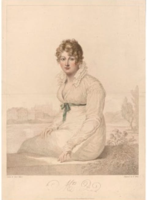
But the original painting has not been traced - this is only an engraving of it. And very recent scholarship has unearthed other engravings of the same portrait, in which the “ornaments” are not green. So the jury is out. There are several other candidates - most of them also untraced - for the image that Austen had in mind.
One of the most dazzling of all 20th century novels, Lolita, is an especially tricky case. I’m glad I first read it in a plain black hardcover with no jacket. Nabokov had strong opinions on this matter (as he did on everything):
After thinking it over, I would rather not involve butterflies. Do you think it could be possible to find today in New York an artist who would not be influenced in his work by the general cartoonesque and primitivist style jacket illustration? Who would be capable of creating a romantic, delicately drawn, non-Freudian and non-juvenile, picture for LOLITA (a dissolving remoteness, a soft American landscape, a nostalgic highway—that sort of thing)? There is one subject which I am emphatically opposed to: any kind of representation of a little girl.
The heart of the novel would indeed be perfectly caught by an image of “a dissolving remoteness, a soft American landscape, a nostalgic highway.” But I’ve never seen an edition that offers this. And, hmm (or maybe Humb …) - Some publishers have not heeded the author’s opposition to “any kind of representation of a little girl”:


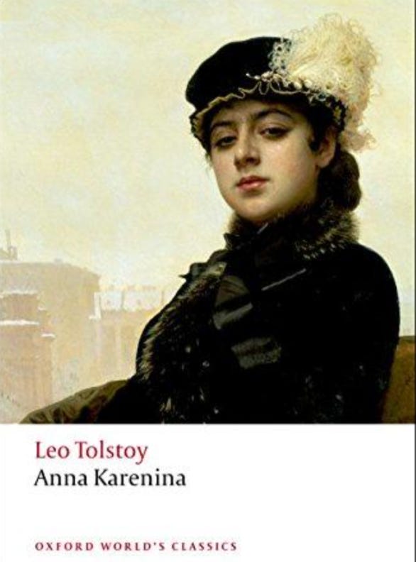
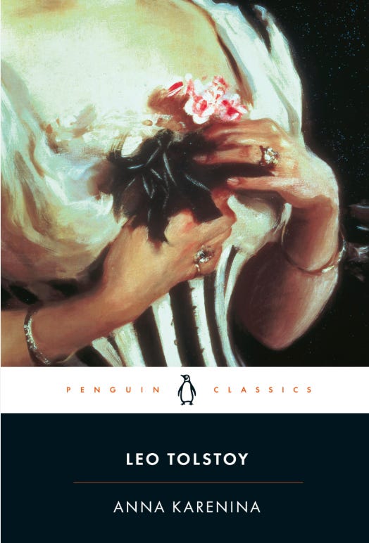
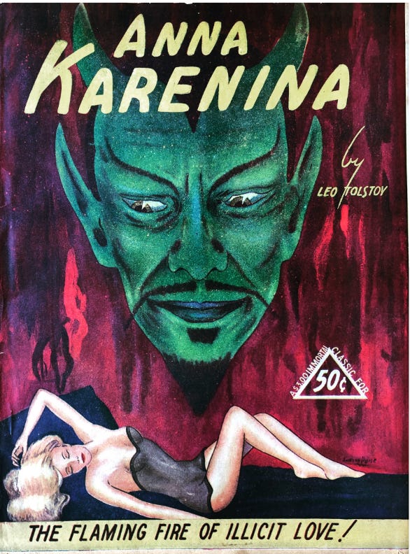
Alarmingly, even Anna Karenina has sometimes had similarly dubious treatment. My favourite cover has long been the Oxford World’s Classics:
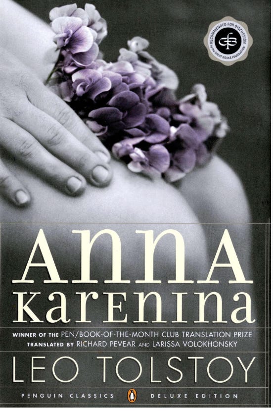
That’s how I imagine her. But I do wonder what Penguin Classics were thinking when they replaced this solid choice:
With this heaving bosom (or is it a pair of buttocks?):
Though not quite as bad as …
Enough of this tastelessness - I’m delighted with the jacket for my forthcoming The Garden: Our 4,000-Year Quest for Paradise. A detail from the House of the Golden Bracelet in Pompeii, it perfectly captures the argument and the range of the book, while indicating that it is as much about gardens in art and literature as the glories of actual gardens through the ages and around the world.

Aha - should have seen that. As in the penny dreadful / Fay Wray cover?!
They are knees :)